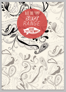
After really critic my work I have decided to try out something more type and layout driven adding my illustrations to see how its really working out and to be honest I think its a much better move to take I think the best way to promote surf is through the skate therefore Im going to keep the look book for the skate but add the surf adverts to it as well as promotional posters and some information on the designs of products for the surf line. After thinking about the appropriateness of the line for in the UK there is a very specific audience and many of them who skate will be interested but skating is now so widely spread it is much more accessible being skate park added to most of the area parks. Yet because They like the brand they would be interested in the shoes t-shirts and other merchandise therefore my thoughts are to add a small clothing section to the store and promote this...It helps to place the thought of surfing into customers heads and having information readily available to access such as where the surfing competitions are through ads in the look books and magazines.
I really love the colours for this ads and the type is clean cut and modern I think in a layout spread with some black and white imagery look fantastic. Colour will be the most influential as vans are the new (in-thing) for teenagers and the bright colours and contrast are a real selling factor.
I have got to be cautious with my paisley influenced designs as they are starting to over power the original message i need to tone thm right down make smaller or less of them yet was good way to see the colours on black and white. Quite excited to start a layout now!
Looking at poster layouts and how I can take things across a range of media as I need to create a range of things the designs need to be compatible with size stock.
Change of a typeface to try and have a little more casual collective mood ive added a few different typefaces. I think they work together yet just for an inside spread maybe not striking enough to sell yet visually intriguing.
Tried layouts to fit vouchers cards etc nice and coours are fitting need to try a few more maybe a little too feminine when the main target sector is male. There iis only a small sector of the store which is female clothing and many of the shoes are unisex.
Looking at stocks I think parcel paper just isnt quite fiiting with the designs they need to be much more up market high end stock possible use of printing proccesses to be used.


No comments:
Post a Comment