At the begining of the designing process i have decided to design the logo as this will form the basis off all the products. When i think of vintage i think of cornices and birds bikes floral patterns. i wanted to start with a black and white images of birds and ad some elements of greggs with the orange etc. a circle is always a good place to start when designing a logo it ties everything together making the eye look what it contains.
Positioning and sizing where its going to lye.
Adding the cup to remind people its the tea room: i asked alot of people for there opinions of this logo and everyone of them said why the bird? yet in my head i had imagined the type of place it was going to be a peaceful enviroment in which many peope associate with birds.
Which typeface?? hmm well i belive the typeface here is very simliar to greggs current one i approved of these logos and colours yet it just doesnt look very corporate or expensive! These would look much better as a surface pattern piece which is something which i have became interested in recently. nit quite appropriate for what i want.
Testing out the four squares effective yet im trying to imagine this onto top of the shop and it just isnt bold enough.
adding there other primary colour as a piece of design eye gets very confused what im trying to want you to look at. Hierachy is so wrong with this too complex!
Experimenting with design on diferent stocks this is important with prit as your colours can appear so different when put against another so this was important to try out!
proved here:: how light and lost does the orange appear on this antique paper apose to the brown recycled above!
Bluue looks beautiful on here so vibrant yet not the right look for greggs im suposed to be showing quality goods this represents a washed out vibe.
Appearing to get more what im after maybe i should just scrap the bird if it doesnt need to be there why is it!
Bringing another type face into the equation i have stripped the greggs right back as it could begin to detract from whats important on the product:
Here trying to add a ittle bit of the information into the design doesnt really work looks cheap and confusing!
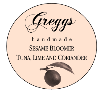
Now this has so much more quality to the appearence sinple clean cut black and white image im going to keep pushing it until it feels right!
Re -introducing the bird i do like this very much with the little bird yet again is there any use for it to be there??